
PRINTING CORRECTLY with ICC profiles
 Download the illustrated article as PDF: https://www.artidomo.eu/icc-profile-farbrichtiges-arbeiten-und-bestellen/
It is worthwhile to learn something about color management before printing.
Using color management only in some areas will not lead to perfect results when outputting to your own printer or to a service provider.
Only when you consistently practice color management throughout the entire processing chain (workflow) will you achieve high-quality results.
Deviation of the printing colors from the monitor
It is a common misconception that if you have a calibrated display and a corresponding printer profile, you will get color-correct output from your printer. Unfortunately, this is not the case.
In a print, several factors are responsible for the final result:
- The printer itself and its manufacturing tolerances
- That used paper to absorb its color and properties ink
- The ink itself
- The control by the computer
The printer cannot reproduce color areas of the screen and vice versa. However, these colors, which cannot be translated one-to-one, must be translated color-blogically.
An ICC profile of a printer describes its color characteristics for the original inks and usually the different papers of the printer manufacturer.
With this, colors can then be translated correctly, so that a light gray does not become a cyan gray.
As soon as papers and inks from other manufacturers are used, the corresponding color behavior must be described by a new ICC profile.
The various paper manufacturers offer these profiles for each of their papers. Here, the manufacturer must create a separate profile per paper type for each relevant printer.
If you print with a service provider, you download the ICC profile for exactly the print medium you want to order. The service provider has already taken into account the press used in the profile here.
In order for Lightroom, Photoshop or other applications to read these profiles at startup and make them selectable in the respective menus, these profiles must be integrated into the operating system.
To do this, if they have been zipped, you must first unzip them and then copy the file to the following location:
Windows: C:/windows/system32/spool/driver/colors
Mac: HD/Library/ColorSync/Profiles
If, for example, Lightroom is open during the copy process, it must be restarted so that the profile can be selected.
Calibrate monitor
Before you edit your images, you should make sure that the colors you see are really those that the camera captured. Otherwise, you are basing your image processing on a basis that is not color correct. Since the Monitr changes over the course of its life, you should recalibrate every 4-26 weeks, depending on the accuracy requirement.
Process the finished image again for printing – soft proofing
You have edited the finished image on the monitor, and if you publish it only on the Internet, it will be viewed there again only on monitors that light up like a DIA. Everything fits.
But if the image is now printed – no matter if you print it yourself or have it printed – you should edit the image again especially for printing.
This is because a paper image is not self-luminous and has flatter colors and weaker contrasts. This can be counteracted by adjusting the image processing. The effect of the paper color can also be specifically counteracted, so that in the end you get a result again as you originally wanted to achieve for the output on the monitor.
When the soft proof is activated, the printout is simulated on the screen as far as possible.
To do this, you create a virtual copy in Lightroom, for example, the easiest way is to use the softproof menu itself:
First we activate via View – Soft Proof – Show Proof
(S key). Make sure that „Simulate paper and ink“ is activated.
Clicking on „Create proof copy“ not only creates a virtual copy, but also names it with the set profile.
So before you click, select the right profile. This way, you still know later exactly what the virtual copy was good for and keep track of it. Even if you later want to print (have printed) again on this paper-printer combination, you do not have to start again.
(Render) priority is about conversion modes that translate colors of the larger color space into the smaller printer color space
A possible depth compensation option should remain deactivated.
Simulate paper color causes the contrast range to be reduced and the respective paper color to be displayed on the monitor as well.
Now you can adjust the image according to the changed display, e.g. increase the brightness, change contrasts, etc.
If you now compare the well-dried printout with the monitor, you will see that the match is much closer to the monitor display than before. Since a print is not self-luminous, it still depends on the color temperature of the light source, of course.
Those who are also dependent on an absolutely color-correct assessment here can buy a not-so-quite inexpensive standard light box.
Output sharpening
When starting image processing, sharpening should be done using e.g. Nik RAW Sharpener or a sensor-related sharpening script.
Immediately before printing, a medium-related sharpening should be performed with the Nik Output Sharpener. The printer type and viewing distance are also queried here.
Link to Photoshop sharpening actions at FineArtPrinter (magazine):
http://shop.will-magazine.de/Photoshop-Aktionen/
Printing on your own printer with ICC profiles
If you want to avoid the quite error-prone nature of the many menus, you should think about buying a printing software like Printao8 or Mirage. Here you only need to specify the printer, paper type, size and output tray. The software ensures the correct profiles and settings. It bypasses the printer driver. This is integrated here.
Sample print via Photoshop CC
Calling up the menu via „File – Print
Draw menu as large as possible
Under the image preview, activate „Simulate printout (soft proof)“ and „Show paper white“ to see final check.
Settings to be made:
- Color management through Photoshop
- Select paper printer profile
- Enable 16 bit
- Normal pressure
- Perceptual (pay attention to paper manufacturer’s recommendation), motif-dependent
- Deactivate depth compensation
After that click on „Printer settings“.
Here, click on the „Layout“ drop-down box and select „Color Matching“.
To completely deactivate color management at printer driver level, select „Epson Color Matching Mode“ here.
__________ Digression
Mac:
Unfortunately, ColorSync cannot be disabled in some cases. It is grayed out. To prevent the driver from destroying all color adjustments again, it is necessary to replace the profiles stored here with those that pass everything through one-to-one – so-called generic profiles.
To do this, download the Generic ICC Profile from http://download.datacolor.eu/files/genericrgb.zip, unpack it and save it under the path „HD-Library-ColorSync-Profiles“.
Then, under Utilities, open the ColorSync utility and under Devices, click on the small arrow for its printer in the respective profiles, then click on „other“ and select the Generic RGB icc.
Video from Datacolor on the subject: https://www.youtube.com/watch?v=YfpQcnvfPUM
______ Digression end
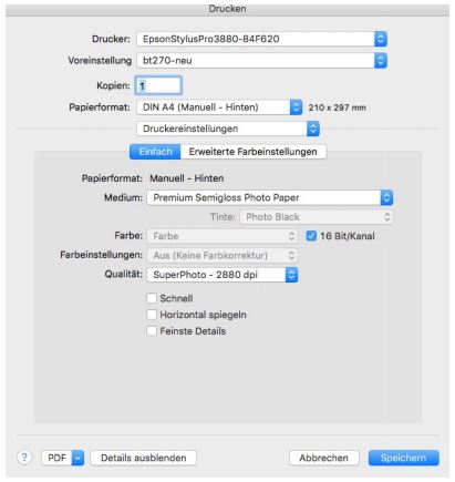
Then switch to „Printer settings
Under Medium, you now select the paper grade that the paper manufacturer recommends for your grade. It is somewhat confusing that another designation is used here again.
For Tecco Baryt BT270, for example, select Premium Semigloss Photo Paper here.
Here, for example, Tecco gives the recommendation 2880 dpi for the above-mentioned paper.
To send the largest possible amount of data to the printer we activate 16Bit.
Even if it’s just nuances these days, you should avoid bidirectional printing in FineArt, and leave „fast“ disabled.